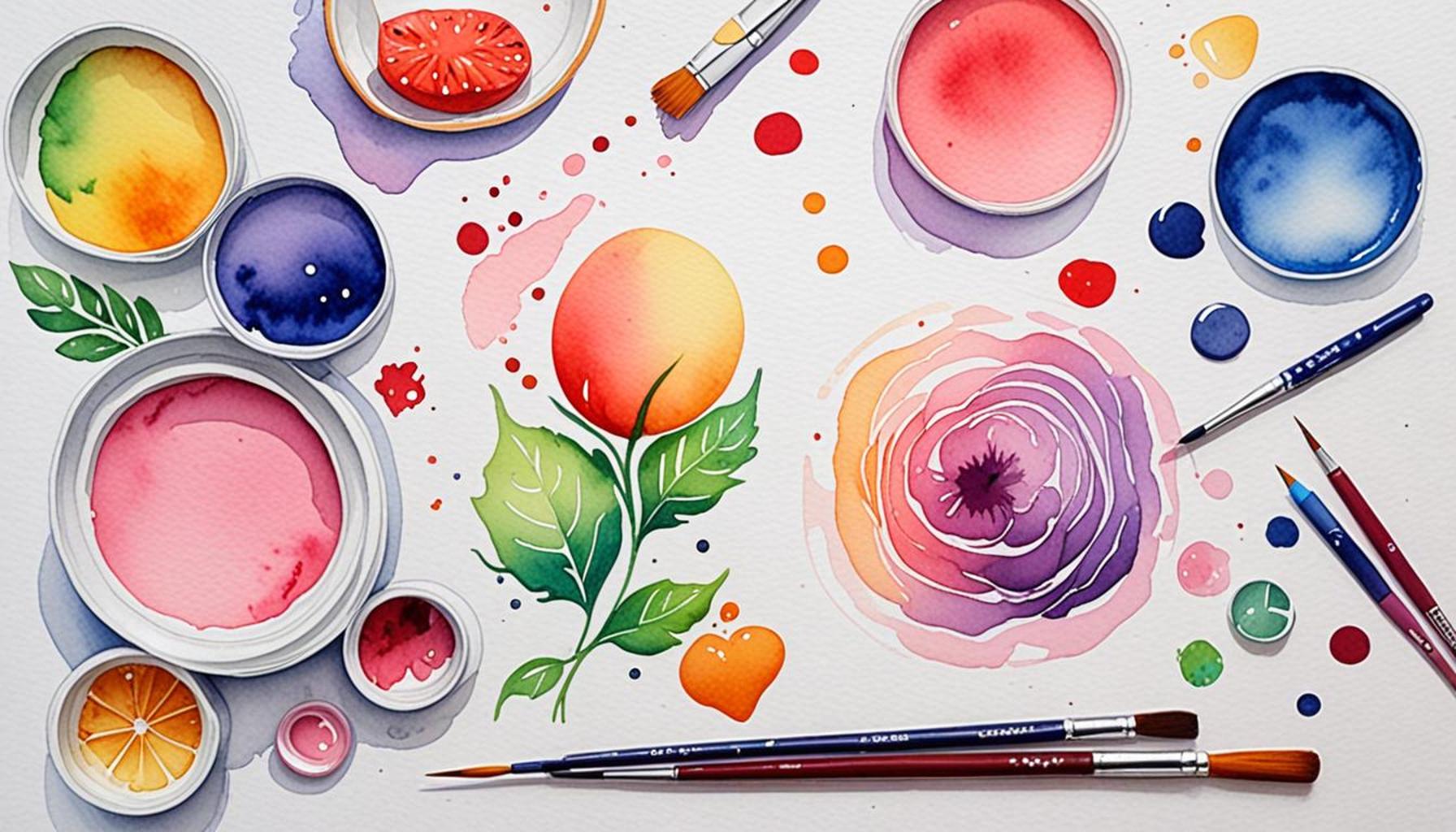
How to Use Colors to Convey Emotions in Artistic Work
The Power of Color in Art
Colors hold a profound significance beyond mere aesthetics; they are intricate emotional triggers that can deeply affect the viewer’s experience. Their influence is extensive, and understanding the underlying principles of color theory can enhance not only the quality of your artwork but also the emotional reactions they provoke in those who engage with it. This exploration of the intersection where color meets emotion reveals how intentional color choices can elevate artistic expression.
The Emotional Spectrum of Color
In various art forms—from painting to photography and graphic design—colors act as powerful communicators of feelings and ideas. For instance:
- Red: This dynamic color is often associated with strong emotions such as passion, energy, and at times, aggression. In artwork, red can create a sensation of urgency, as seen in Mark Rothko’s vibrant color fields that evoke just as much intensity as they do serenity, depending on their context.
- Blue: Commonly linked to tranquility and reliability, blue can impart feelings of calmness, as witnessed in the soothing landscapes painted by artists like Claude Monet. However, blue can also be perceived as melancholic, emphasizing introspection and solitude.
- Yellow: The brightness of yellow often encapsulates joy and optimism, which can instantly lift the spirit. For example, Vincent van Gogh used yellow deliberately in his “Sunflowers” series to convey warmth and happiness. Yet, when overused, it can lead to feelings of unease or anxiety, reminding us of the dual nature of emotional responses.
Techniques for Manipulating Color
Artists have adeptly leveraged the emotional responses elicited by colors throughout history. Through the combined use of hues, saturation, and contrast, they can:
- Create a specific mood or atmosphere: The choice of colors can transport viewers into different emotional landscapes—bright tones can evoke joy, while darker shades might contribute to a more somber tone.
- Direct attention: By employing particular colors in focal areas, artists can draw the viewer’s gaze to significant elements, thereby emphasizing their importance within the artwork.
- Influence narratives: Different colors can reinforce themes and narratives within art. For example, the use of warm hues in a depiction of conflict might highlight the intensity of the moment, while cooler tones could suggest resolution and peace.
The Journey of Mastering Color Emotion
Whether you are an aspiring artist or a seasoned creator, understanding the psychological implications of color can significantly enhance your artistic expression. By experimenting with color palettes and studying the works of renowned artists, you can gain deeper insights into how colors interact to elicit specific feelings. Not only does this knowledge empower you to evoke emotional responses from your audience, but it also invites them to connect on a more profound level with your creations.
In conclusion, delving into the vibrant world where color and emotion intertwine can transform your approach to art. As you refine your understanding of color theory, you will discover new ways to resonate with your viewers, creating artwork that speaks not only to the eye but to the heart as well.
CHECK OUT: Click here to explore more
Understanding Color Theory in Artistic Expression
To effectively use color as a tool for emotional expression in artistic work, one must first grasp the essential principles of color theory. This foundational knowledge is not just for artists but is beneficial for anyone involved in creative industries. Color theory encompasses the relationships between colors, how they interact, and the emotional responses they are likely to evoke. By harnessing these principles, artists can craft pieces that resonate more deeply with their audience, harnessing color as a force that extends beyond mere visual appeal.
The Color Wheel and Its Significance
The color wheel is a fundamental element of color theory, typically divided into primary, secondary, and tertiary colors. Understanding these categories can aid in selecting harmonious color combinations that convey desired emotions:
- Primary Colors: Red, blue, and yellow are the building blocks of color. When combined, they create an extensive variety of other colors, which can be used strategically in artwork to influence emotion.
- Secondary Colors: Formed by mixing primary colors, orange, green, and purple offer additional emotional associations. For example, orange typically radiates warmth and enthusiasm, making it suitable for works that inspire cheerfulness.
- Tertiary Colors: These result from mixing a primary color with a secondary color. The nuanced tones created can add depth and complexity to a piece, often leading the viewer to feel intrigue or contemplation.
Incorporating a variety of colors from different sections of the color wheel allows artists to create a rich visual narrative. For example, a painting that combines both vibrant yellows and deep purples can evoke a tension that provokes thought and engagement.
Warm vs. Cool Colors
Delving deeper into color categories, it’s crucial to understand the distinction between warm and cool colors. Warm colors, such as reds, oranges, and yellows, often evoke feelings of warmth, excitement, and energy. Artists frequently employ these hues to stimulate visceral reactions and create a sense of immediacy. Think of the sun-drenched landscapes of Georgia O’Keeffe where warm hues exude vitality and passion.
On the other hand, cool colors—like blues, greens, and purples—typically evoke calmness and tranquility. These colors are often associated with peace and reflection, making them ideal for works that aim to create a soothing atmosphere. Artists like Yves Klein have famously used deep blues to elicit a sense of depth and contemplation, sending viewers on an introspective journey.
Utilizing warm and cool colors not only influences the immediate emotional response but also enhances the storytelling aspect of the artwork. The juxtaposition of these color groups can highlight conflict, character development, or contrast themes within the narrative of the piece.
Ultimately, the key to wielding color as a means of conveying emotions lies in understanding the emotional implications behind each shade and the connotations associated with color combinations. By applying this knowledge in practice, artists can forge a powerful connection with their audience, guiding them through the emotional landscape of their work.
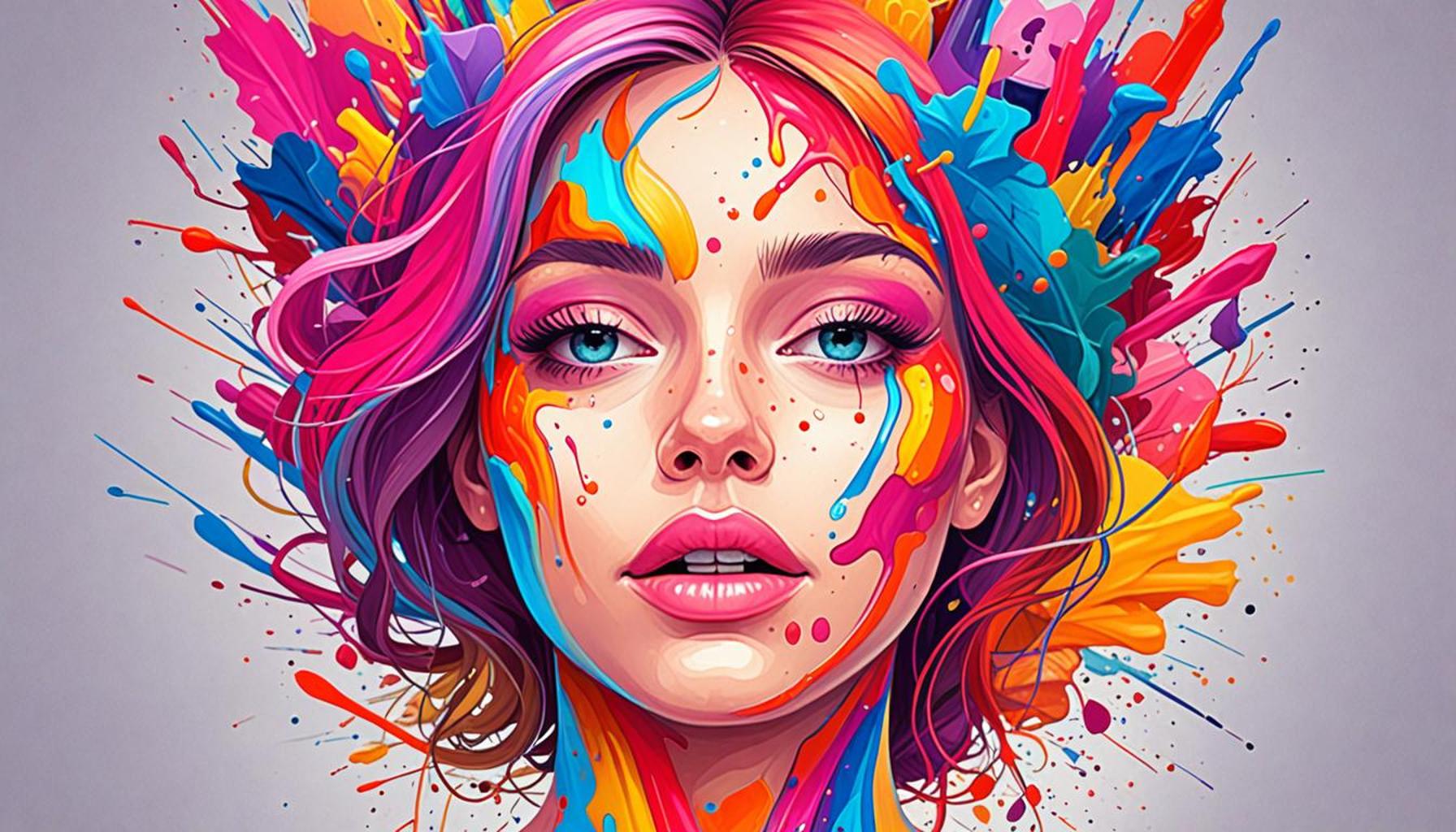
Exploring the Psychological Impact of Colors in Art
In the realm of artistic expression, colors serve as a powerful medium not merely for aesthetics but also for conveying emotions and evoking responses from the viewer. Understanding the psychological implications behind each hue can elevate the depth of your artwork and significantly enhance emotional impact. For instance, the color red often symbolizes passion and intensity; it can inject energy into a piece, making it more captivating. Artists such as Mark Rothko and Wassily Kandinsky utilized colors purposefully to achieve this very effect, demonstrating how a canvas can be transformed into a vibrant emotional experience.
Moreover, certain colors tend to be universally associated with specific feelings. For example, the gentle tones of blue often evoke a sense of calmness and serenity, making it an ideal choice for artwork meant to promote relaxation or reflection. On the other hand, yellow is frequently linked to optimism and happiness, drawing viewers in with its warm vibrancy. By selecting a color palette that aligns with the desired emotional response, artists can effectively guide the viewer’s journey through their work.
Utilizing Contrasting Colors for Dramatic Effect
An intriguing method to convey emotion through color is the use of contrast. Juxtaposing warm and cool colors can create tension or highlight specific components within an artwork. For example, an artist might incorporate black alongside bright colors to convey feelings of despair amid vibrancy, stirring a complex emotional response in the viewer. This technique not only adds depth to the piece but invites the audience to engage in a dialogue about the dualities of emotion.
Furthermore, colors can alter the way individuals perceive shapes and spaces within an artwork. Warm colors tend to advance, making objects appear closer, while cool colors tend to recede, enhancing the perception of distance. By mastering this aspect of color theory, artists can manipulate a viewer’s attention, guiding them through the emotional landscape of their work with greater effectiveness.
| Category | Description |
|---|---|
| Warm Colors | Evoke emotions like passion, energy, and warmth. |
| Cool Colors | Invoke calmness, tranquility, and a sense of distance. |
Ultimately, an artist skilled in the use of color can communicate nuanced emotional narratives, prompting viewers to reflect on their feelings and unspoken experiences. The intentional selection of colors is more than just a creative choice; it forms a dialogue between the artist and the audience that can resonate on multiple levels.
CHECK OUT: Click here to explore more
Color Psychology: Unpacking Emotional Associations
Understanding the psychological implications of color is essential for artists aiming to evoke specific feelings in their audience. Different colors are often imbued with universal meanings shaped by cultural influences, personal experiences, and even biological responses. By tapping into this well of emotional associations, artists can create works that resonate on a deeper psychological level.
The Power of Red: Passion and Danger
One of the most powerful colors in art is red. Often associated with passion, love, and intensity, it can also evoke feelings of anger and aggression. Artists such as Mark Rothko have skillfully deployed red hues in their compositions to evoke raw emotion. For instance, Rothko’s iconic color field paintings use various shades of red to create an overwhelming sense of passion and urgency, inviting viewers to engage emotionally.
Moreover, in advertising and branding, red is frequently used to trigger impulse and stimulate appetite, emphasizing its energizing properties. This understanding of red’s multifaceted nature can help artists thoughtfully select this color when aiming to provoke complex emotional reactions.
Blue: Calmness and Melancholy
Blue is another color laden with emotional significance. Often linked to feelings of tranquility and peace, blue can also communicate sadness and melancholy. Artists like Pablo Picasso utilized different shades of blue throughout his “Blue Period” to evoke feelings of sorrow and introspection. The somber tones resonate profoundly, leading audiences on a journey through emotional depth.
From the cool blues of serene waters to the deep indigo of twilight, blue can transform the emotional landscape of an artwork. Even in non-representational works, the choice of blue can set the mood, making it an invaluable asset in any artist’s palette.
Green: Growth and Harmony
Green is often associated with nature, renewal, and harmony. Its different shades can evoke a range of emotions from revitalizing energy to restful calmness. Artists like Claude Monet effectively used lush greens in his Impressionist landscapes, reflecting the vibrancy and life found within nature.
In a cultural context, green has also come to symbolize sustainability and eco-friendliness. As more artists explore themes of environmental awareness in their work, the color green gains even greater significance as an emotional anchor, connecting viewers to core themes of growth and interconnectedness.
The Role of Contrast and Saturation in Evoking Emotion
While understanding individual colors is crucial, the contrast and saturation of colors also play a vital role in shaping emotional responses. High saturation colors are often perceived as more vibrant and energetic, while muted tones can evoke feelings of nostalgia or introspection. For instance, an artwork featuring a balance of saturated reds against muted greys can create a dynamic tension, prompting the viewer to feel both urgency and somberness.
Moreover, contrasting colors can attract attention and create focus, guiding the viewer’s eye and emotional journey through the work. Think about the works of artists such as Vincent van Gogh, who employed contrast effectively to illustrate intense emotions and depict the beauty of everyday life.
Ultimately, a nuanced understanding of how to harness **color psychology** allows artists not only to convey personal narratives but also to connect with their audience in a profound and meaningful way. Whether exploring fundamental colors or playing with contrasts, the application of color in art becomes a powerful conduit for emotional expression.
SEE ALSO: Click here to read another article
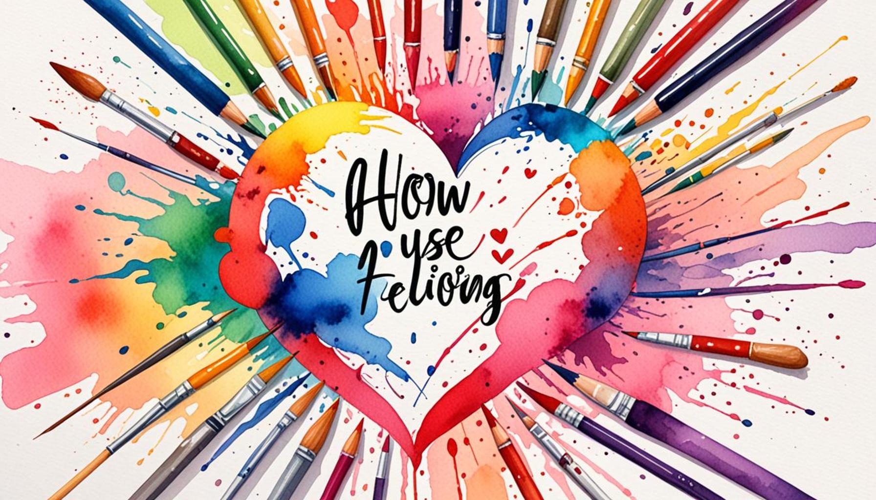
Conclusion: The Emotional Palette of Art
In conclusion, mastering the art of using color to convey emotions opens a world of creative possibilities for artists. Understanding the inherent psychological implications of colors such as red, blue, and green allows creators to tap into a wellspring of emotional expression that transcends words. Each color unfolds a narrative that can evoke passion, tranquility, or a sense of growth, making it essential to consider their associations when crafting visual art.
Moreover, the intricacies of contrast and saturation add layers of depth to an artwork, guiding the viewer’s emotional journey. Through the vibrant interplay of colors, artists can capture dynamic tensions and subtleties that provoke thoughtful reflection and engagement. This multifaceted approach to color not only enhances aesthetic appeal but also shapes the viewer’s experience, making art a formidable medium for emotional exploration.
As artists continue to employ color as a powerful storytelling tool, they also weave in cultural considerations and personal narratives, enriching the dialogue between their work and the audience. By remaining aware of these psychological dimensions, artists can ensure their creations resonate on a profound level, inviting viewers to delve deeper into their emotional landscapes. As you embark on your own artistic journey, remember that the colors you choose hold the potential to shape perceptions and stir feelings, creating a lasting impact in the realm of visual storytelling.